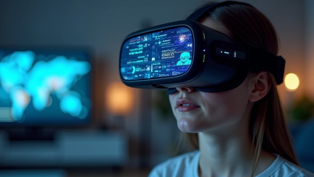
You’ll need a VR headset with at least 2160×2160 pixels per eye for comfortable text readability, though higher resolutions around 4K per eye deliver truly crisp clarity. Lower-resolution headsets like the Quest 2 at 1832×1920 per eye struggle with small text, while high-end options like the HP Reverb G2 offer greatly improved legibility. Your graphics card also plays an essential role—RTX 4080 or 4090 GPUs provide substantial clarity gains over older models, and there’s much more to optimizing your complete VR text experience.
Current VR Headset Resolution Standards for Text Clarity

While modern VR headsets have made considerable strides in display technology, text readability remains a persistent challenge that directly impacts user experience.
When you’re using current-generation headsets like the Oculus Quest 2, you’ll encounter a resolution of 1832×1920 per eye, which often struggles with small text on complex interfaces like flight management computers.
The HP Reverb G2 offers notable improvement at 2160×2160 per eye, making text considerably more legible. However, pixel density still poses limitations—older headsets like the DK2 deliver perceived resolution equivalent to 640×480 on a 23-inch screen.
This compromised clarity means you’ll need to carefully consider font sizing and viewing distances to achieve ideal readability in virtual environments.
Pixel Density Vs Perceived Readability in Virtual Environments
Understanding resolution numbers alone doesn’t tell the complete story of text readability in VR—pixel density plays the defining role in what you’ll actually see and read comfortably. When you’re using older headsets like the DK2, you’re essentially looking at text through a 640×480 equivalent display, making small fonts nearly impossible to read without zooming.
| Device Type | Pixel Density | Text Readability |
|---|---|---|
| Standard Monitor | 96 ppi | Excellent |
| DK2 VR Headset | Low ppi | Poor |
| Reverb G2 | High ppi | Good |
| Future VR Displays | Ultra-high ppi | Excellent |
Each eye only receives half the available pixels, greatly reducing clarity. You’ll need headsets with considerably higher pixel density than traditional monitors to achieve comparable text readability in virtual environments.
Hardware Requirements for Optimal Text Display
You’ll need specific hardware capabilities to achieve the pixel density standards that make text truly readable in VR environments.
Your headset’s resolution directly impacts text clarity, with devices like the HP Reverb G2’s 2160×2160 per eye greatly outperforming lower-resolution options for reading small text on cockpit displays.
However, higher resolutions demand more from your graphics card and CPU, creating a performance trade-off you’ll need to balance based on your system’s capabilities.
Minimum Pixel Density Standards
When you’re evaluating VR headsets for text-heavy applications, pixel density becomes the make-or-break factor that determines whether you’ll strain your eyes or read comfortably for hours.
You’ll need to meet minimum pixel density standards of around 600 ppi to achieve comfortable reading of small text elements. However, that’s just the baseline – you’ll want to push higher for ideal results.
Remember that each eye only sees half the available pixels, so a 1920×1080 headset effectively delivers just 960×1080 per eye. This dramatically reduces text clarity.
You’ll get markedly better results with 4K resolutions or higher, which provide the pixel density necessary for crisp, legible text that won’t cause eye fatigue during extended use.
Headset Resolution Comparisons
Since different VR headsets deliver vastly different text readability experiences, comparing their specifications reveals why some models excel at displaying crisp text while others leave you squinting.
When conducting headset resolution comparisons, you’ll discover considerable differences that directly impact your ability to read digital displays and small text in virtual environments.
The Oculus Quest 2’s 1832×1920 per-eye resolution creates challenges when reading multi-function displays and flight management computers.
However, the HP Reverb G2’s superior resolution provides noticeable clarity improvements for digital avionics.
Key factors for ideal text readability include:
- Hardware requirements – Nvidia RTX 3080 or higher handles high-resolution demands
- Settings optimization – Pixel density between 1.2-1.3 enhances clarity
- Future upgrades – Nvidia 40 series GPUs greatly improve performance
Performance Impact Considerations
Achieving crystal-clear text in VR demands substantial hardware power, as your graphics card must render twice the pixels while maintaining smooth frame rates. High-end GPUs like Nvidia’s 40 series deliver peak performance for making text readable at higher resolutions.
While an RTX 3070 shows moderate improvements over the RTX 2070, significant clarity gains require upgrades to RTX 4090 or 4080.
Supersampling enhances text sharpness by increasing pixel density, but you’ll need to balance performance carefully since it impacts frame rates substantially. Your system also needs a high-end CPU and sufficient RAM for smooth VR text applications.
Tools like Oculus Tray Tool let you adjust pixel density settings, helping improve text clarity without excessively sacrificing performance.
Comparison of Popular VR Headsets and Text Performance

Several popular VR headsets deliver vastly different text readability experiences, making your choice essential for applications requiring clear displays.
The HP Reverb G2’s 2160×2160 pixel per eye resolution greatly outperforms the Oculus Quest 2’s 1832×1920 resolution when reading small text on MFDs and flight management computers.
Graphics card power affects your experience, with RTX 3080 users reporting clearer text on the G2.
Consider these performance differences:
- Quest 2 – Struggles with small instrument text due to limited pixel density, even with adjustment tools
- HP Reverb G2 – Provides superior text clarity for cockpit displays and detailed interfaces
- Older headsets like DK2 – Offer 640×480 perceived resolution, making text nearly unreadable for professional applications
Your hardware combination determines ideal text performance.
Font Design Principles for Virtual Reality Applications
When you’re designing text for VR environments, you’ll need to take into account three critical elements that directly impact readability regardless of headset resolution.
Your font size and spatial positioning must account for VR’s unique depth perception challenges, while your typeface selection can make or break user comprehension in low-resolution displays.
You’ll also want to carefully balance color contrast and any animated effects to guarantee your text remains legible without causing visual fatigue.
Size and Spatial Placement
Unlike traditional screen-based interfaces, VR text requires careful consideration of physical dimensions and spatial positioning to guarantee readability.
You’ll need to measure font size in degrees rather than pixels, ensuring your text meets minimum legibility standards in three-dimensional space.
Consider these essential placement guidelines:
- Height positioning – Place text at eye level (approximately 1.6 meters) and orient it perpendicularly to the observer for maximum visibility.
- Angular sizing – Use a minimum of 1.33° (2.32 cm at 1 meter) for readable text, though 3.46° (6.04 cm) provides ideal legibility.
- Line length optimization – Keep lines between 20-40 symbols to maintain focus and prevent reading fatigue in the virtual environment.
Proper spatial placement transforms how users interact with your VR content.
Typeface and Weight Selection
Beyond positioning your text correctly in virtual space, you’ll need to choose typefaces that work within VR’s unique visual constraints.
Sans-serif fonts are your best choice because their clean lines and lack of decorative elements enhance clarity in low-resolution headset displays. You should prioritize squarish typefaces like Exo 2, which offer superior legibility in three-dimensional environments.
When selecting font weights, stick to regular and bold options. Thin and light weights become nearly impossible to read through VR headsets’ current resolution limitations.
You’ll find that adjusting weight rather than size often works better for creating content hierarchy and ensuring text stands out against backgrounds. Focus on typeface legibility above aesthetic appeal to maintain readability across different VR experiences.
Color and Animation Effects
High contrast between font colors and backgrounds becomes critical for VR readability, as headset resolution limitations make subtle color differences nearly invisible.
You’ll need bright, distinct color combinations to help users quickly identify and read information without eye strain. When implementing animation effects, subtle movements can effectively guide user attention to important labels without overwhelming the experience.
Essential color and animation strategies for VR text:
- Maximize contrast ratios – Use stark color differences between text and backgrounds to compensate for lower headset resolution like the DK2.
- Apply controlled animation – Implement gentle movements that draw focus while maintaining readability and avoiding excessive distractions.
- Create visual hierarchy – Combine strategic color choices with targeted animation effects to prioritize information and improve navigation.
Distance and Scaling Considerations for VR Text
When positioning text in VR environments, you’ll need to contemplate how distance greatly affects readability and user comfort. Your viewing distance considerably impacts text sharpness, with ideal readability achieved around one meter from your eyes.
At this distance, minimum readable font size should be approximately 2.32 cm in height, though 6.04 cm provides better visibility.
Scaling considerations for VR text become critical due to limited pixel density in headsets. You must adjust scaling settings based on your proximity to the display, ensuring text remains legible regardless of position.
Position text at eye level using 1.6 meters as reference height for effective placement. Keep line length between 20-40 symbols to enhance focus and comprehension, as longer lines become difficult to read in immersive environments.
Graphics Settings That Impact Text Sharpness
Several graphics settings directly control how sharp and legible your text appears in VR environments.
You’ll need to optimize multiple rendering parameters to achieve crystal-clear readability that won’t strain your eyes during extended use.
Here are three critical adjustments for sharper text in VR:
- Texture Resolution – Use high-resolution textures and disable mipmaps by setting Mip Gen Settings to “No Mipmaps” to prevent distance-based blurriness.
- Anti-aliasing Configuration – Implement proper anti-aliasing techniques to eliminate jagged edges that make text appear rough and difficult to read.
- Post-processing Calibration – Reduce bloom effects and adjust auto exposure settings to prevent text from appearing washed-out or overly bright.
Properly calibrating these rendering settings based on your specific headset specifications will dramatically improve text clarity and overall readability.
Future Resolution Technologies and Text Readability
While today’s VR headsets struggle with text clarity at standard resolutions, tomorrow’s 8K displays will revolutionize how you read in virtual environments.
You’ll experience dramatically sharper text as increased pixel density eliminates the blurriness that currently plagues VR reading experiences. These 8K resolutions will make smaller text readable without constant zooming or awkward adjustments.
Increased pixel density in 8K VR displays will eliminate text blurriness and make reading comfortable without constant adjustments.
Advanced rendering techniques will complement these higher resolutions. You’ll benefit from enhanced anti-aliasing and chromatic aberration correction that further improves text clarity.
As headset technology evolves, developers will optimize text sizing using degrees rather than pixels, ensuring perfect legibility across different resolution standards.
Continuous user research will drive these improvements, guaranteeing that text remains accessible as virtual experiences become increasingly immersive and realistic.
Best Practices for Developers Creating VR Text Content
Creating readable VR text requires you to follow specific design principles that account for the unique challenges of virtual environments. While pixels per inch determines display clarity, your typography choices considerably impact user experience and readability.
You’ll achieve ideal text legibility by implementing these essential practices:
- Font Selection and Sizing: Use sans-serif fonts with a minimum readable size of 3.46° (approximately 6.04 cm height at 1 meter distance), avoiding decorative styles that compromise clarity in immersive settings.
- Spacing and Layout: Maintain line height between 1.0 to 1.3 for improved focus, ensuring consistent spacing between lines and positioning text at eye level perpendicular to the observer.
- Visual Contrast: Implement high contrast between text and background colors using bright, distinct combinations to enhance text perception in VR environments.
Frequently Asked Questions
What Resolution Should I Use in VR?
You should use your VR headset’s native resolution with pixel density settings of 1.2-1.3 through tools like Oculus Tray Tool. This’ll improve text clarity while maintaining performance balance for readable content.
What Is Pixels per Degree in VR?
You’ll find pixels per degree measures how many pixels appear in each degree of your field of view in VR, directly affecting text sharpness and readability in your headset.
What Is 8K Resolution in VR?
You’ll experience 8K resolution as 7680×4320 pixels in VR, delivering four times more detail than 4K. This dramatically improves text clarity and visual sharpness, though you’ll need powerful hardware for smooth performance.
What Is Retina Resolution for VR?
You’ll need around 60-100 pixels per degree to achieve retina resolution in VR, requiring displays exceeding 4K per eye. This guarantees you can’t distinguish individual pixels, creating crystal-clear visual experiences.
Leave a Reply